Is there a way to make all items in a row in a widget the same height? We have a few widgets on our homepage (Home - CT State - info sessions and upcoming event sections) in 4 columns/2 row set ups where some items may be longer than others and then the rows don’t line up. I did have a minimum height set but sometimes a title will be too long even to fit that. Ideally I’d like them to match heights to the longest item in a row. I tried playing with grid and flex styles in css but couldn’t figure out a way to do it on JUST the two homepage widgets. Is this something anyone else has dealt with on their sites? Thanks!
Due to the markup LiveWhale uses for its widget columns, this may be difficult. I think CSS subgrids may be able to do what you want, but I have not played with that much.
I usually don’t use the widget column settings and just apply a CSS class to the widget that organizes the results into grid or flex layouts.
Something like this?
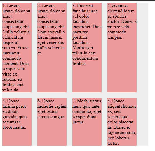
I know flex can definitely do it, but not in the column layout you currently have. I haven’t worked with grid yet. The code below made the above example.
HTML:
<div class="container">
  <div class="item">
    <div class="content">
      1. Lorem ipsum dolor sit amet, consectetur adipiscing elit. Nulla vehicula elementum neque id rutrum. Fusce maximus commodo eleifend. Duis semper velit vitae ex rutrum, eu finibus erat vehicula.
    </div>
  </div>
  <div class="item">
    <div class="content">
      2. Lorem ipsum dolor sit amet, consectetur adipiscing elit. Nam convallis lorem massa, eget venenatis nulla vehicula et.
    </div>
  </div>
  <div class="item">
    <div class="content">
      3. Praesent faucibus urna vel dolor faucibus imperdiet. Duis porttitor porttitor faucibus. Morbi eget tellus in erat condimentum finibus.
    </div>
  </div>
  <div class="item">
    <div class="content">
      4.Vivamus eleifend lorem ac sodales auctor. Donec a mi nec velit commodo tempus.
    </div>
  </div>
  <div class="item">
    <div class="content">
      5. Donec lacinia purus eu dolor gravida, quis accumsan dolor mattis.
    </div>
  </div>
  <div class="item">
    <div class="content">
      6. Donec molestie sapien eget lectus cursus congue.
    </div>
  </div>
  <div class="item">
    <div class="content">
      7. Morbi varius nunc quis ante commodo, eget semper diam luctus.
    </div>
  </div>
  <div class="item">
    <div class="content">
      8. Donec aliquet rhoncus ex, sed scelerisque dolor placerat in. Donec id dignissim arcu, nec lobortis tortor.
    </div>
  </div>
</div>
CSS:
.container {
  display: flex;
  background: #EEE;
  width: 500px;
  gap: 20px;
  flex-wrap: wrap;
}

.item {
  background: #e99;
  width: 100px;
  flex: 100px 0 0;
}
Flexbox and Grid can only create a grid of items that are siblings of each other. So, @mischlern 's example works because of that. If you don’t use the LiveWhale widget columns arg, you can easily achieve that with CSS. If you keep that arg, you may be able to use CSS subgrid, which allows children of grid items to inherit their parent’s grid tracks. But then you would be writing CSS to override the default columns behavior. The former is probably the easier option.
As a proof of concept, I was able to achieve the following by changing some CSS…

.lw_widget_column_wrapper {
  display: grid;
  grid-template-columns: repeat(4, 1fr);
  grid-template-rows: repeat(2, auto);
  gap: 1rem;
}
.lw_widget_column {
  display: grid;
  grid-template-rows: subgrid;
  grid-row: span 2;
}
That works without changing any HTML. In practice, though, you would want to scope that CSS to specific widgets. And you may want to add additional rules for mobile styles.
1 Like
Thanks folks! For what it’s worth, yes, the widget “columns” setting and lw_widget_columns markup is getting retired in LiveWhale 3.0, almost everyone has card-style layouts that use CSS flexbox or grid and don’t require LW to “re-order” stuff into separate column containers.
For example, Yvonne, just above the events widgets on your homepage that you mentioned, I see a news list that uses flexbox in that way:
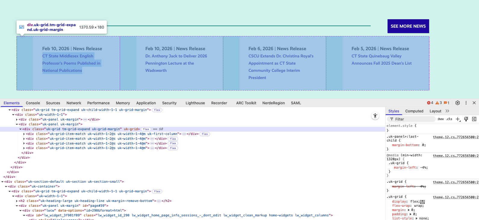
I bet it wouldn’t be hard to revamp the events widget (or, make a new widget to test) to use that kind of .uk-grid class and disable LWC Widget columns to get the intended effect. Hope this helps!
I am a big fan of CSS Grid. My favorite technique uses 3 lines of code to achieve a very flexible layout…
.grid {
  display: grid;
  gap: 2rem;
  grid-template-columns: repeat( auto-fit, minmax(250px, 1fr) );
}
That will fit as many items in a row as possible without the items getting smaller than 250px. Items will automatically wrap for different window widths, creating as many columns as necessary. So you get built-in responsive layouts without media-queries.